Lost and Font
(changes in fonts, and your shopping experience!)
The Cruel History of Typography
Typography is the art of designing the parts of letters in a language, also known as designing a font, in order to make the written language more readable, cheap and appealing. Since the invention of the printing press by Johannes Gutenberg in the 15th century, different eras in history had different fonts popular at the time.
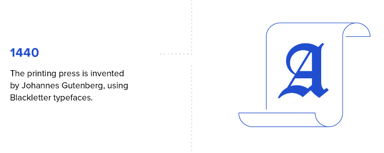
The history starts off with the invention of the printing press by Johannes Gutenberg in 1440, but unlike our digital printers today, the printers then could only use one font assigned to them, and the process of printing a book could take weeks. Gutenberg believed that printing presses should be a replacement for writing books, therefore the font he had chosen for the printing press was similar to the handwriting of writers and manuscripts at that time- the Blackletter font. The only downside for this was that the font made the words thick, and so it limited the amount of text that could fit into a single page, creating longer books that required even more time to set up.
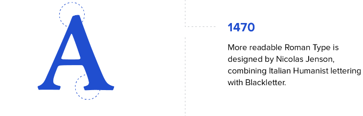
In 1470, Nicolas Johnson noticed how Blackletter typefaces take a lot of space in a page, and so created the first Roman typeface, which is based on blackletter and Italian Humanist lettering. It’s just like Blackletter but without the thickness and the extra details, for it to take less space from a page, resulting in shorter books with faster setup times. Jenson’s Roman font was the first to be based on typographic principles rather than manuscript models, and it has become an influential font over the decades.
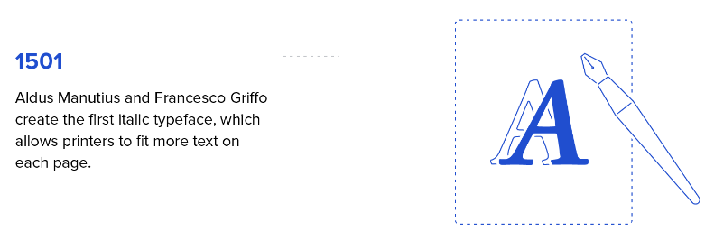
In 1501 Aldus Manutius and Francesco Griffo created the italic typeface, in order to save even more space when printing a page. Nowadays, italic is still important to emphasize text.
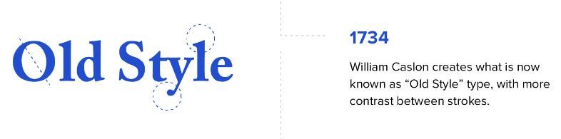
All of the typefaces until this point were either made to mimic handwriting at the time or to save space in a page, but all of these fonts, especially the italic one, made the text unreadable (it’s pretty hard reading a full page with text like this). That’s why in 1734 William Calson created a typeface we call today “Old Style”, which made letterforms more distinguishable from one another at a glance improving readability. In other words- he made letters not seem connected and look distinct from each other.
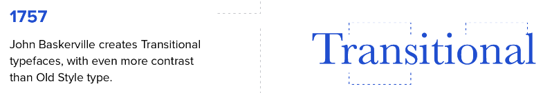
In 1757 John Baskerville created a typeface similar to “Old Style”, but with even more contrast between letters, and with even blacker ink. People hated it at the time but it was revived in the 20th century, and until today people say this is the best font in history.
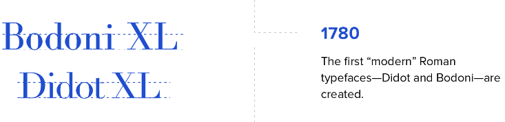
First of all for your general knowledge a serif is a little decoration tag in a letter. Now there are no serifs. Now there are tons of serifs (look closely). Serifs came into fashion in 1780, when Firmin Didot and Giambattista Bodoni created modern serifs, which were best suited for big displays rather than small texts. The difference between these two fonts are minor, but it’s in the placing of the letters.

In 1815 Vincent Figgins designed the Antique font, also called Egyptian, which was more attention grabbing, because of its slab serifs- the serifs were now uncurved symmetrical slabs, and it became popular, and also made printing commercials and posters popular, because how attention grabbing the slabs were.
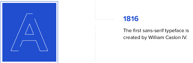
Every good hi-story needs its villain, and in this case the villain is sans-serif. A year after printing posters and commercials became popular, the competition to make the most attention-grabbing font has begun. William Caslon IV created the first sans serif font, called “Two Lines English Egyptian”. You already know what a serif is, and sans means ‘not’, so we can assume the font wiped out all of its serifs (supposed to be sad). Sans serif is influenced from this blocked lettering used in classical antiquity, in which serifs were missing.
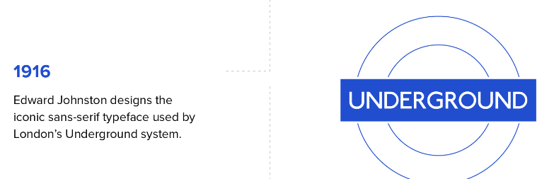
In 1916 Edward Johnston designed the iconic “Johnston Sans” aka “New Johnston” typeface that is still used in the London Underground.
Later in 1920, Fredric Goudy became the first full time designer, meaning that his whole job was to create fonts (until that time the font inventors were crafters and creating fonts was just an artistic side-hustle). In his career Goudy created a lot of iconic fonts, the Goudy Old Style and the Copperplate Gothic.

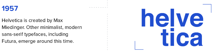
Once again the sans serif emerges from the dark, and in 1957 Max Miedinger designed a lot of sans serifs, including the most popular font of the 20th century. The 2oth century saw a big rise in sans serif fonts, like Paul Renner’s ‘Futura’, and Hermann Zapf’s ‘Optima’.
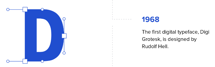
In 1968 Rudolf Hell made the first digital font, the Digi Grotesk. It was unreadable in small sizes but it was still digital so it’s geometric and cool.
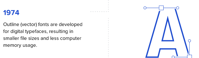
In 1974 the first outline fonts were developed, which resulted in even more geometric shaped letters, better readability at the same time, and font files being easier to download.
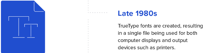
In the late 1980’s Apple created an outline font standard called “TrueType” fonts for both computers and printers as one under the .TTF mark.

Up until this point Macintosh and Windows had different standards for font files, but when Apple released in 1997 the “OpenType” font standard, there was a universal font file for everyone to use, under the .OTF mark.
In the same year, the CSS program language was created, which is a style language for websites, and in it people can font style stuff. This was the first language that involved styling rules we all know, like size, color, mark, italic, or bold on the internet.
A year later Internet Explorer 4 added the function of adding fonts created by CSS to their websites, but no one really paid attention.

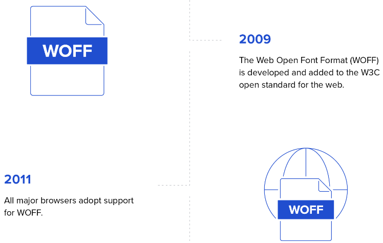
In the 21st century the Web Open Font Format was created, and also all the browsers supported this font file type, so now everyone could make a font from whatever computer they desire and download it wherever they want, under the .WOFF mark.
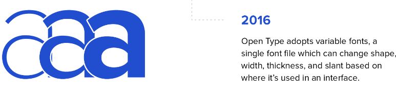
The most recent historical font change is the 2016 OpenType update, which gave fonts the option to have different variants regarding size and shape from default (until then people had to design how the font would look in each size, with boldness, etc).
Regarding the future, there is still stuff to add to the world of fonts, most importantly fonts in other languages than English. If you’re a native speaker of a language that’s not English, you can probably relate to how annoying it is to search for fonts and realize 90% of them don’t work well in your language.
Microsoft Changing their Default Font
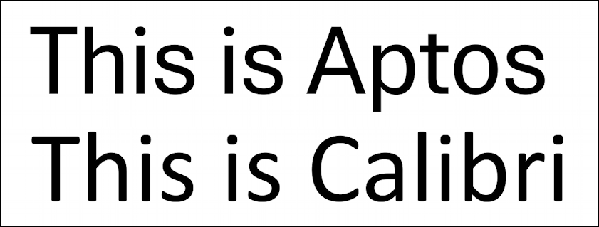
As we all know, Microsoft is one of the biggest tech companies in our capitalistic world, and it has one important daughter company, which is Office. Office made Word, Excel, PowerPoint, Outlook, WordPad, and other significant digital document-writing applications. Office’s products make a lot of money for Microsoft, and they always want to make more money from it. That’s the reason every few decades Microsoft changes the default Office font to a more appealing font, that will make the people want to spend more money. Back in 2007 they changed the default font in Office from Arial (a sans-serif) and New Times Roman (W Iconic Font) to Calibri (a humanist sans-serif that’s honestly incredible, created by Lucas de Groot). In 2021, Microsoft wanted to appeal to even more customers, and even though there wasn’t a problem with Calibri at all, they decided to find a new default font. They gave testers five fonts to give feedback on, the nominees being Grandview, Seaford, Skeena and Tenorite, and the winner being Bierstadt. It was created for Microsoft by Steve Matteson, and is a grotesque-humanist style sans-serif typeface. Its original name was ‘Bierstadt’, after a mountain in Colorado Matterson used to live in, but people didn’t take it seriously, so it was changed to ‘Aptos’ after a rural town in California that came into Matterson’s mind, and resembles the nature he would be in when inventing this font, by writing letters on paper. Aptos has a huge advantage on other fonts that the l and I look distinct, and Matterson still works on Aptos versions for other languages, different weights for Aptos, for us to use Aptos in every wanted situation.
London Underground’s Minor Font Change
As all 2023 London Global Round scholars know, the London Underground is the unique transit system of railways in London, and wherever you are in this magnificent city, you’ll always see on the side of the street the sign of the Underground, marking an underground train station. If you’ve carefully read the ‘Cruel History of Typography’ summarization I made, you might have noticed that the person who made the iconic font for the London Underground was made by calligrapher Edward Johnston, and is called “New Johnston” or “Johnston Sans”. The reason it’s so iconic is because it’s one of the first sans-serif fonts that actually looked beautiful while simple, and also because it brought uniformity to the London Underground stations owned by different rail companies. In the 1970’s designer Ecchi Kono updated the typeface to adapt the new printing technology, making super minor changes in the font that doesn’t affect at all on how the font looks with a virgin eye, like changing a dot in a shape of a circle into a dot in the shape of a diamond.
Back in 2016 the font was slightly changed once again for a 100 years anniversary to the font, and to make it fit to the digital age. First of all, the # and @ symbols were added to the font, now called “Johnston 100”, and also slight adjustments in the shape of the lettering- try to see it for yourself!
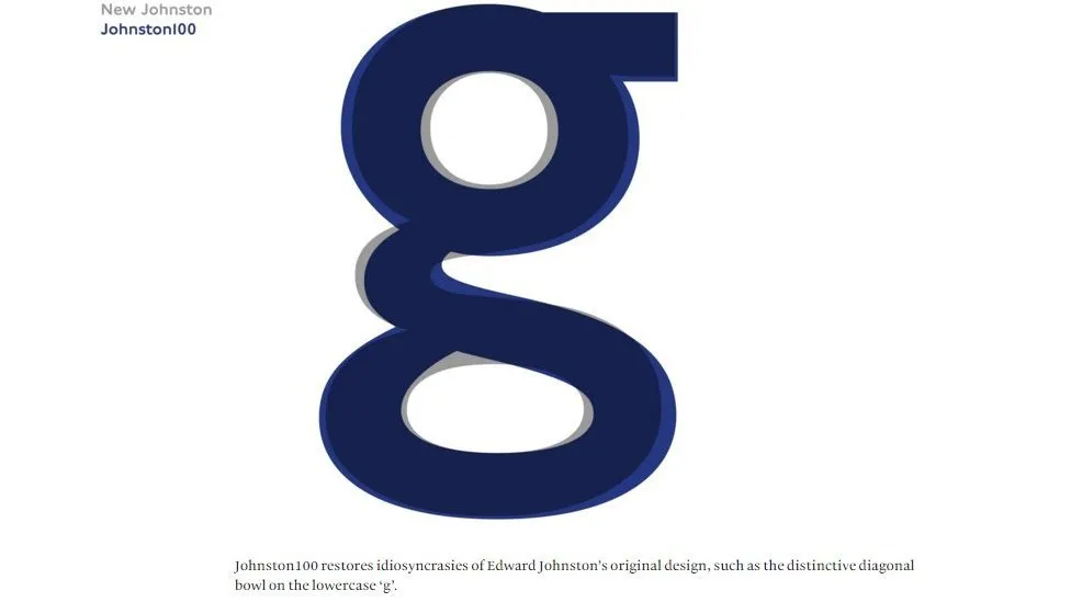
That’s right scholars- there is barely any difference. The greatest change in the whole font can be seen in the letter ‘g’, and even there it’s not that major. The head of Transport for London, Jon Hunter, who made the font, said that they really examined the simple, beautiful, readable soul of the font that made it revolutionary at the time, and adjusted it to the social media age, in which fonts should look a little thicker to look fine in mobile, and as I’ve written, should include the hashtag and at symbols.
The Difference Between Serif and Sans-Serif
Serif = Small tags in a letter, just like in this j for example. Do you see how under the dot there is this tiny tiny bit of ink that’s going left? j that’s what we call a serif.
In typography a serif is just a font with serifs, like this one.
Sans Serif = a font with no serif. Sans derives from some English language and means “without”. So I know it’s confusing, but a sans serif does not have serifs! Hello I am a sans serif and as you can see in this j there are no serifs!
U.S. Department of State Changing its Default Font 🦅💣
In January of 2023 Secretary of State Antony Blinken decided to order employees to start transitioning from using the Times New Roman font that was used for 20 years (and is a serif), to using Calibri, a font that is a sans-serif and so much ‘cleaner’. This change came from the Secretary’s office of diversity and inclusion, and its justification was that Calibri is clearer to read, and so it improves readability with smartphones and screen readers (screen readers help people with optic disabilities a lot). This change has received tons of criticism and complaints from workers arguing that Calibri isn’t aesthetically pleasing, as it’s too clean. Also they were annoyed they had to change a lot of their files to a different font out of a pretty unnecessary decision. The exact same happened 20 years earlier, when the Department of State changed to Times New Roman from Courier New 12 font, which is the typewriter font, because Times New Roman takes the same space but offers a crispier touch. Then it also faced criticism, but over the years people got over it.
The Odd Job of the Forensic Font Expert
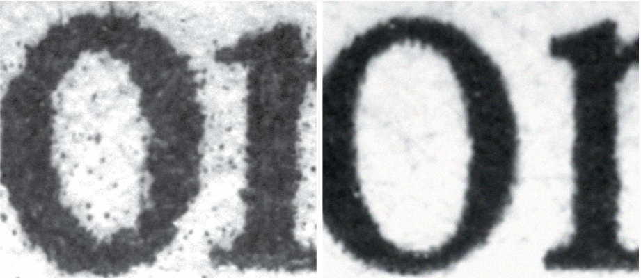
The subject of forensics is an interesting one. Forensics is basically using science to prove things on court. One illegal act is the act of forgery. Forgery is when you fake a certificate, just like how some of you fake your parents’ signatures. To determine if forgery happens or not, people hire a forensic font expert, which is a guy who knows a lot of stuff regarding fonts and printers. This guy can use a digital microscope to see how the ink is spilled around each letter (in some printers tiny bits of ink can be “wicking”, or bleeding), and so can determine the printer of the certificate, in addition to the type of font. From these two details the guy can determine in most cases if a certificate is outdated or not, and so help the court to bring justice.
Oh! Another thing that this guy does is just to check if fonts are used under legal copyright conditions (I can use a font someone has copyright on and it’s not legal, so to determine if I really used that font or just a similar one, he’s the guy who will check that), or under legal conditions in states (California requires information on prescription labels to be above 12-point font, so to determine if someone had a font below 12 points, he’s the guy to check that).
This is the job of Thomas Phinney, who uncovers forgeries and solves modern-day crimes using his vast knowledge in fonts. He’s the first to make this his main job, and he sees typography as a combination of art and science.
He had a lot of cases in which he checked if fonts are legal for use, if there has or has not been a case of forgery, and his biggest case yet was to check using his typography knowledge whether memos of George W. Bush that proved he disobeyed the air force, but used his connections to delete these records from his military records, and he couldn’t prove that these documents were actually real. My fella still waits for the perfect case to come, and he’s so happy to have a job that makes him enjoy what he’s doing.
The Backlash Against Self Checkout
When you want to buy something from a store, like a new alpaca plushie, you’re used to pay for it by giving it to an employee in a checkout booth who will scan it with a barcode, and will tell you how much you need to pay. In the 1980’s the self-checkout machines were invented for reducing labor costs, as with them the buyers can scan the product barcodes, weigh products with a touchscreen, bag the items, and pay for the stuff they bought using the machine all by themselves without any necessary help from employees, therefore stores get to save money. This self-checkout method wasn’t popular at all until the Covid-19 pandemic, in which people didn’t want to get in physical contact with others, and therefore preferred to pay by themselves so no employee could theoretically infect them with Covid. At that time the big shopping chains, such as Walmart, Cotsco, Wegmans, Booths, and Five Below added to their shops self-checkout stations, and even made them the main method to check out.
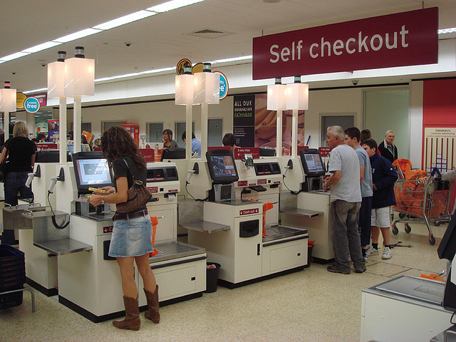
Now, after the pandemic, all of the big shopping chains I have listed above stopped using self-checkout stations, because people misidentified which fruits or vegetables they were buying when asked by the machines (it’s hard to know what breed of apple you’re buying just by looking at it), customers who bought alcohol would need to wait a long while until an employee who probably smokes a cigarette on the other side of the store will check if their age is verified, it’s easier to steal products as you’re the one scanning the products, barcodes sometimes don’t scan properly, people can cheat the weight when weighing products and so pay less than what they’re supposed to, and people just hate that they’re doing this work in front of a robot (capitalist dystopia vibes).
All of the bad things I’ve listed lead to inventory loss, aka “shrink”, and as a result the big markets lose 4% of their money (a lot). For a while they tried to tighten their security measures, but saw it didn’t work so that’s why there are barely self-checkout machines today.
The Invention of the Barcode
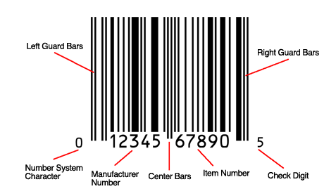
A Quick Introduction and Background.
A barcode is a way to represent visual data in a way a machine can read. A barcode is built out of detailed lines and numbers. The exact width and location of each line is necessary for the barcode’s “unique identity”, each identity representing a different product in a store. The main advantage about these is that people can scan these tags using machines that scan them and understand the product’s variables, like its price. Before barcodes each product had a price tag on it, and when checking out from a store, the checkout employees had to look at all the price tags and sum it up to the amount of money you have to pay. In the supermarket, because each person buys dozens of products, this process turns out to be exhausting and long. In 1947, a manager of a local food chain in Philadelphia, Food Fair, requested from Drexel Institute of Technology to find a solution for this problem, and one of its employees, Bernard Silver, accidentally overheard it.
Woodland Getting the Idea of the Barcode.
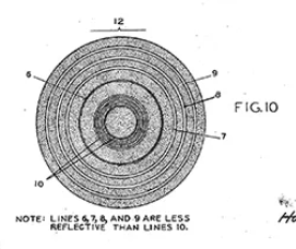
Silver is not the main inventor of this fascinating code- but his friend who was told about the request by him- Joseph Woodland. The two of them started working on a system that used ultraviolet ink but the ink faded and was expensive, so this didn’t work out. They kept working on a different solution, and Woodland dropped out of university to put 110% of his effort on inventing this piece of technology. In his grandfather’s apartment in Miami Beach, and it took him until 1949 to get the idea of the bar-code. It was Morse Code that gave him the idea, as he learned it when he was in Boy Scouts. “I remember I was thinking about dots and dashes when I poked my four fingers into the sand and, for whatever reason—I didn’t know—I pulled my hand toward me and I had four lines. I said ‘Golly! Now I have four lines and they could be wide lines and narrow lines, instead of dots and dashes. Now I have a better chance of finding the doggone thing.’ Then, only seconds later, I took my four fingers—they were still in the sand—and I swept them round into a circle.” - that’s how he came up with the idea of a code made out of lines that can hold in it the identity of a product. Unlike our barcodes today, in the original form they were shaped like a bullseye, as it’s easier to scan it from all sides. In 1951 they filed a patent on the idea, and made a rough prototype of a machine that can read the barcode using a 500-watt incandescent bulb that could roughly translate the code into electricity flows, that could be roughly translated by an oscilloscope. Their idea didn’t fit the technology available in this era, so they had no real way to properly scan a barcode.
A Ten Years Jump to a Time With a Real Way to Properly Scan a Barcode.
In 1960 the laser was invented (laser is an acronym for Light Amplification by Stimulated Emission of Radiation), and it’s this super bright light that doesn’t spread a lot (means it’s good), and can “read” black and white lines extremely well. In the end of the 60’s RCA cooperation bought Woodland’s patent, and they made a scanning laser to scan the barcodes that were changed from their bullseye form to the rectangular shape we know today because of how hard it was to print the bullseye, and tested it on the Kroger grocery chain. This was a success for the supermarket as the function of checkout was way faster, and also shops could hold the scanning statistics in their database, and actually see what products sell more, and so make their business better. The first barcode checkout was made in Marsh’s Supermarket in Troy, and over the years it became a technology we use in our day to day lives! Woodland even got a National Medal of Technology!
Amazon Go!
Amazon Go is a new type of store made by amazon, that totally changes the shopping experience- you don’t need to pay, just walk out of the store and you’ll automatically pay for what you took. Watch this 1 minute video to see for yourself: https://www.youtube.com/watch?v=NrmMk1Myrxc . Everything is explained really well in the video, just the thing I feel these cute challenge writers can ask about is how exactly this Amazon Go thingy works- when you enter the store and scan the QR code, your phone with the credit card is in the store’s algorithm. The store is full with cameras and sensors on the shelves, and so when you pick something up the sensors sense this and the cameras see this and all of this data is brought up to an AI model that determines what you really took, and adds it to your “virtual cart”. This data is analyzed by something WSC has an unhealthy addiction with asking on- machine learning. I’m pretty sure there is a point about it in another chapter on this curriculum, so I won’t delve deeply on it right now. Nevertheless, it’s the field of study in AI concerned with training the AI model to understand data and algorithms. This means that in Amazon Go, the more purchases that happen, the better the AI is on finding out what product you’ve taken. Back to Amazon Go, it serves mostly basic groceries and made up meals, and you can find these in the U.S. (first one opened in Seattle), and London.
Quick Introduction to QR Codes
QR Codes are these two dimensional barcodes consisting of black squares arranged in a square grid of white background (like this barcode). Our phones can scan the QR and Quickly Respond with the url or file it represents. This was originally made for a Japanese automobile company for storing more advanced stuff that barcodes can’t store (like urls and files). Another thing is that unlike barcodes QRs have these reference squares on some of their corners and are called fiducial markers (to give the camera sensor a perspective on the size of the barcode).

QR Restaurant Menus are Lame 😴
It might be unfamiliar for non-Americans reading this, but in the land of freedom most restaurants today use QR menus. Basically instead of getting a menu on a paper your table has on it a QR code that leads you to the restaurant’s website in which you can see the menu. It was made out of the need to physically interact the least possible with the diners during the pandemic, but now after we’ve passed that, restaurants don’t want to afford money on physical menus, so they keep the QR menus. This of course makes a lot of people angry, such as Anne Theriault, who wrote an opinion article about it- about why QR restaurant menus are just lame. One thing she does give off for them menus is that unlike physical ones, QR menus catch up with your traffic on the websites so restaurants can know better what sells.
1) It Ruins the Communal Aspect of Dining with Close People.
Ms. Theriault claims that QR menus force people to look at their phones to find what they want to order, and this act of looking at your phone when you’re supposed to be with your family or friends just ruins the vibe of togetherness. Most of us are addicts to our iPhone, and if in these scenarios if we’re forced to open our phones, why not also check some insta stories? (keep reading these summaries, don’t check your stories!!!).
2) QR Menus have Security Risks!
People who know a lot about how to hack into a wifi (using their phone) can get a lot of info about you if you scan the QR code and sign in to the restaurant’s website to view the menu.
3) Physical Menus Serve as Actual History.
Unlike QR Menus, that can be deleted from existence the second a restaurant closes its business, a physical menu will always exist (unless you burn it or something). These physical menus might serve as historical evidence of this era in the future, as physical menus in the past serve today as a major historical source. Historian L. Sasha Gora claims physical menus give us an insight on when and how animals and plants appeared, disappeared, or maybe reappeared. An example would be the passenger pigeon- a pigeon breed that became extinct as a result of overhunting for making delicious pigeon pies. When it started to be endangered the menus didn’t change, but when it became totally extinct it disappeared from the menus. From this data we can infer that at the time people didn’t care about the state of the passenger pigeon breed, and hunted it until its extinction. It also gives us historical insight to how culture was- like how in 1970’s California restaurants used to give women a special “ladies’ menu”- a menu printed without prices, so they wouldn’t know how much their dates are spending on them.
4) Ohhhhhhh But the Aesthetic 🤌👌
QR menus have websites, right? Each restaurant doesn’t have a web designer who will design them a full menu out of zero (like me). So they use a basic website menu template and maybe change the colors- that’s it. In a cool physical menu you can express your restaurant better. Two totally different restaurants- one expensive 3 michelin stars pastas, and the other cheap hamburgers. Both of them use the same website design template and look almost similar. It ruins the vibe of the expensive one that needs to look prestigious, and it ruins the cheap one that needs to look fun.